
This site is reader-supported. As an Amazon Associate we earn from qualifying purchases. When you buy through links on this page, we may receive an affiliate commission at no additional cost to you. Our editorial picks are independent of commercial relationships.
What Makes Fountain Pen Ink Cool
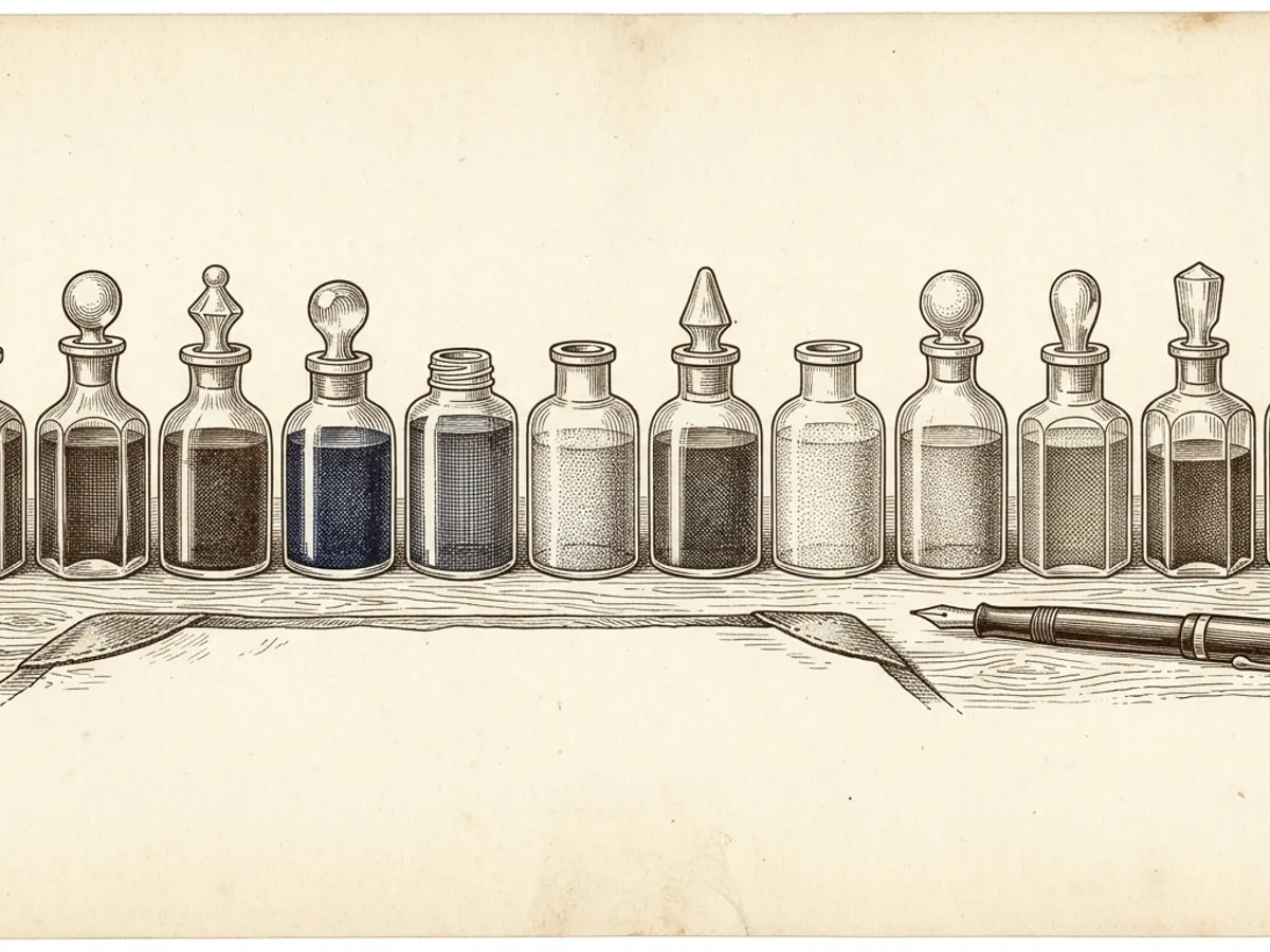
Most fountain pens come with a cartridge of perfectly serviceable blue or black ink. That gets a pen writing immediately — but it represents only a fraction of what fountain pen inks can actually do. The broader world of bottled fountain pen ink includes metallic particles that catch light with every stroke, inks that shift color as they dry, formulas whose chemistry has not fundamentally changed since the Middle Ages, and shades of saturated red, forest green, teal, and warm amber that have no counterpart in the ballpoint or rollerball formats most people grew up with.
What makes a fountain pen ink genuinely cool usually comes down to a few distinct qualities: optical effects under light, color behavior as the ink dries and reacts with paper, and depth or saturation of hue. An ink that looks one color wet and shifts to another after drying, or that throws a contrasting secondary color at the edges of each stroke, or that produces a metallic gleam visible across a room — these are the inks that turn the act of writing into something worth paying attention to.
This guide covers the categories that attract the most enthusiasm from the fountain pen community, with specific products worth looking at in each.
Shimmer Inks
Shimmer inks contain fine metallic or mica particles suspended in a standard dye base. The particles are visible in the liquid — most shimmer inks have an obvious sparkle even in the bottle. After the ink dries on the page, the particles remain embedded in the dried film and catch incident light, producing a visible glitter effect in the line. Under a desk lamp or at the right angle to a window, a shimmer ink can make handwriting look as if it contains metallic foil.
Diamine’s Shimmertastic range is the most accessible entry point into shimmer inks. Diamine is a UK-based manufacturer with a long history in ink production, and the Shimmertastic line spans a wide range of base colors — deep blues, rich purples, forest greens, warm golds, vivid roses — each paired with compatible metallic particles. The dye bases flow smoothly and reliably; the particles stay in suspension without excessive settling in most pens. Diamine inks use the standard international cartridge and converter format, making them compatible with a wide range of pens from brands including Kaweco, Faber-Castell, Monteverde, and others.
J. Herbin’s 1670 Anniversary range approaches shimmer with more complexity. The 1670 Emerald of Chivor is one of the most-discussed inks in the fountain pen community: a teal-green dye base with gold shimmer particles that also produces a vivid red sheen when the ink pools on smooth paper. J. Herbin is a French manufacturer established in 1670 — the series name references the founding year — and the anniversary line represents their premium tier. The visual combination of shimmer, sheen, and teal base color in Emerald of Chivor is unusual even by specialty ink standards; few other bottled inks match the optical complexity it produces on quality paper.
Diamine shimmer inks on Amazon.
One practical note: shimmer inks require more attention than standard dye inks. Metallic particles can settle in the barrel and accumulate in the feed’s narrow channels over time. Pens used with shimmer inks benefit from a brief shake before each writing session and a thorough flush with room-temperature water every few weeks. For very fine or extra-fine nibs, shimmer inks carry a higher risk of particle accumulation in the feed channels; medium nibs are the more reliable pairing.
Sheening Inks
Sheen is distinct from shimmer. While shimmer relies on physical particles, sheen is a purely optical phenomenon produced by the ink’s dye chemistry. As a sheening ink dries on the page, the dye concentrates at the edges of each stroke and in areas where ink has pooled at the start or finish of letters. Viewed at certain angles, these concentrated areas appear to shift to a completely different color — the secondary sheen color — distinct from the base tone of the ink.
A deep blue might sheen copper at the stroke edges. A forest green might sheen red or gold. A rich burgundy might produce a teal secondary at the thicker strokes. The effect is most visible on smooth, slow-absorbing paper — stocks such as Clairefontaine, Rhodia, and Tomoe River are well-suited to showing it. On absorbent or rough-surfaced papers, the ink absorbs too quickly for the dye to concentrate at the edges, and sheen largely disappears.
Pilot Iroshizuku is the benchmark line for sheening fountain pen inks. Pilot, one of Japan’s major pen and ink manufacturers, produces this range with names drawn from Japanese natural imagery. Tsuki-yo (moonlit night) is a blue-green that produces a striking red sheen on quality paper. Ama-iro (heavenly color) is a softer sky blue. Fuyu-gaki (winter persimmon) is a warm, subdued orange-amber. Each ink in the range flows with excellent consistency and offers the lubrication that makes nibs feel smoother than their metal finish alone would suggest.
Pilot Iroshizuku inks on Amazon.
Robert Oster is an Australian brand known for highly saturated colors with pronounced sheen. The brand has built a following among ink enthusiasts for producing unusual shades — vivid blues, greens, pinks, and purples in tones that are difficult to find from other manufacturers — and their inks are generally well-regarded for consistent flow. Robert Oster inks are less widely available in chain retailers, which contributes to their appeal among enthusiasts looking for something genuinely distinctive.
Diamine’s standard range includes many inks with notable sheen properties. Diamine Majestic Blue, Diamine Oxblood, and Diamine Ancient Copper are three examples where sheen is a consistent and visible characteristic on smooth paper. Because Diamine inks are widely available in generous 80ml bottles at accessible prices, they offer a practical way to explore sheen without committing to premium price points.
Iron Gall Inks
Iron gall is one of the oldest writing ink formulas still in use. Historical versions combined iron sulfate with tannins extracted from oak galls in an acidic solution. The formula was used in medieval manuscripts, Renaissance correspondence, early musical scores, and foundational legal documents. Many of the most significant written records in European history were produced with iron gall inks.
The chemistry produces two notable effects as the ink dries and is exposed to air. First, the color deepens over hours from an initial gray-blue or brownish tone to a richer, darker shade — a visible shift that writers notice as they work. Second, the iron compounds bond with the paper’s cellulose fibers, making the dried mark genuinely water-resistant. The result is an archival quality that most standard dye-based inks do not approach.
Modern iron gall inks from established manufacturers are significantly diluted compared to historical formulas, reducing the acidity to levels that contemporary fountain pens can handle with regular maintenance. Writers who flush their pens periodically find modern iron gall inks workable as everyday inks.
Rohrer & Klingner Salix and Scabiosa are two of the most consistently recommended modern iron gall options. Salix is a blue-black variety with reliable, consistent flow; Scabiosa leans toward a gray-violet tone with a subtler post-drying shift. Rohrer & Klingner is a German manufacturer with production roots going back to 1892, and both inks have a long track record in the fountain pen community for balancing archival performance with reasonable pen safety.
Diamine Registrar’s Blue-Black is another well-regarded iron gall formulation from the same UK manufacturer, available in large 100ml bottles — practical for daily writers who consume ink at higher volume.
Iron gall fountain pen inks on Amazon.
The maintenance discipline for iron gall inks is simple: use the pen regularly, and flush thoroughly before setting it aside for more than a week or two. Extended sitting periods with iron gall ink in the barrel carry a higher risk of feed deposits than standard dye inks, given the mildly acidic chemistry.
Vivid Everyday Colors
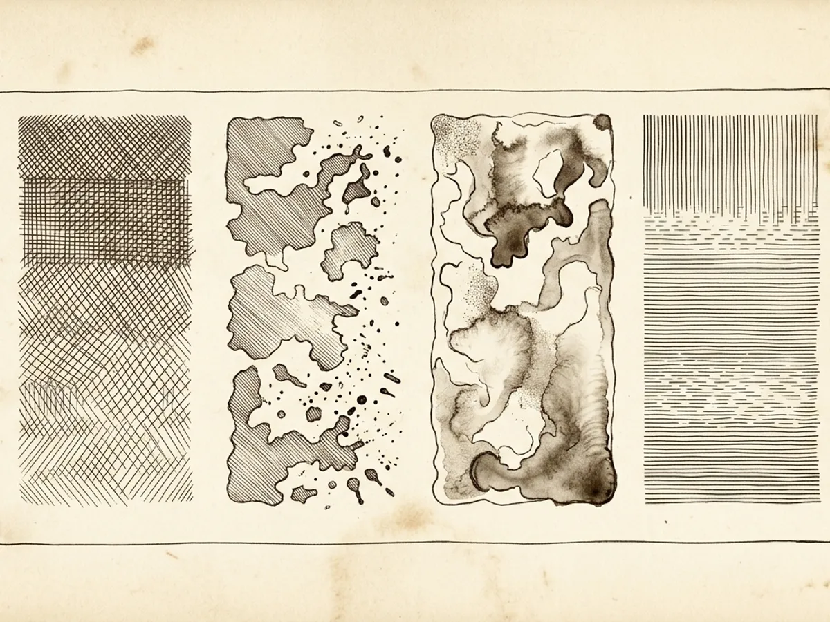
Not every interesting fountain pen ink requires special chemistry or optical effects. Part of what makes fountain pen inks worth exploring is the sheer range of colors available — saturated hues across the full spectrum that do not exist in ballpoint or rollerball formats.
Fountain pen inks come in vivid reds, deep purples, forest greens, warm teal-greens, rich browns, and amber tones that most ballpoint users have never encountered as writing options. A well-chosen color suited to someone’s handwriting and their stationery can make daily note-taking feel more considered — which is part of why many fountain pen enthusiasts keep two or three pens inked simultaneously with different colors.
Diamine’s standard dye-based range spans over 80 colors and is one of the best places to start exploring color variety. Consistently recommended options for visual impact include:
- Diamine Amaranth — a saturated magenta-pink, vivid without being aggressive on the eye
- Diamine Violet — a rich, warm purple with good legibility across most paper stocks
- Diamine Chocolate Brown — an earthy, warm tone that pairs naturally with cream-colored writing paper
- Diamine Imperial Purple — a deeper, more formal purple than Violet, with notable sheen on smooth paper
All Diamine standard-range inks use the standard international converter and cartridge format, and the 80ml bottle format offers excellent value per milliliter.
Noodler’s is a US-based brand with an unusually wide range of colors and formula types. Noodler’s Baystate Blue is one of the most intensely saturated blues available in fountain pen ink — the color density is notably higher than comparable blues from other manufacturers. However, Baystate Blue is known to be chemically aggressive with certain pen materials, including some converters and rubber seals, and is incompatible with some pen designs; checking compatibility before use is advisable. Noodler’s Bulletproof Black, by contrast, is broadly compatible, water-resistant once fully dried, and offers low cost per milliliter — a practical choice for writers who want a reliable, permanent black.
Noodler’s fountain pen inks on Amazon.
Sailor is a Japanese pen and ink manufacturer whose range extends well beyond the blues and blacks the brand is best known for. The Sailor Manyo collection draws on traditional Japanese aesthetics for a range of muted, refined tones — sage greens, dusty purples, quiet pinks — that occupy a distinctly different register from the vivid end of the Diamine range. For writers who want something subtler and more historically inflected, Sailor Manyo inks are worth considering.
Our Top Cool Ink Picks

Based on a structured review of manufacturer specifications and the consistent conclusions of owner reviews across fountain pen communities and specialist retailers:
Best shimmer ink: Diamine Shimmertastic — choose the base color that suits your style. The range is broad enough for both dramatic and understated tastes, and Diamine’s consistency as a manufacturer makes this the natural first shimmer ink to try.
Best shimmer and sheen combined: J. Herbin 1670 Emerald of Chivor — for a single ink that delivers the most visual complexity, the combination of teal base, gold shimmer, and red sheen is unusual at any price point. It is the ink most often cited when fountain pen enthusiasts are asked to name something genuinely spectacular.
Best sheening ink: Pilot Iroshizuku Tsuki-yo — the blue-green body with red sheen is the benchmark recommendation from the community for sheen without shimmer particles. The production quality is consistently high.
Best iron gall: Rohrer & Klingner Salix — a reliable blue-black that deepens after drying, from a manufacturer with a documented production history going back more than a century. For everyday archival writing, Salix is the most frequently recommended modern iron gall formulation.
Best vivid everyday color: Diamine Amaranth — saturated, fully legible, distinctively different from standard blue or black, and compatible with standard international pens and converters without any special maintenance requirements.
Browse bottled fountain pen inks on Amazon.
Tips for Using Specialty Inks
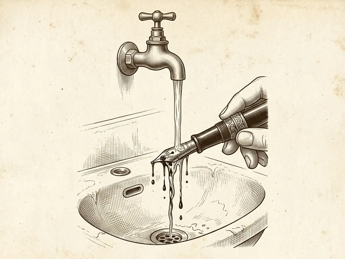
A few practical notes before filling a pen with an unusual ink for the first time:
Flush regularly. Shimmer inks benefit from a flush with room-temperature water every two to three weeks during active use. Standard dye inks can sit longer without issue, but periodic flushing is good practice for any ink type. Iron gall inks should not sit unused in a pen for extended periods without a flush first.
Match ink to paper. Sheen and shimmer effects require fountain-pen-friendly paper to develop fully. Standard copy paper absorbs ink too rapidly — the ink does not pool at the stroke edges, sheen does not form, and shimmer is minimal. Smooth, heavier-weight writing papers from manufacturers such as Clairefontaine or Rhodia allow these effects to develop as intended.
Choose the right nib size for shimmer inks. Shimmer particles need enough ink volume to move through the feed without catching. Medium nibs are the most reliable pairing. Fine and extra-fine nibs create narrower feed channels where particles are more likely to accumulate over time.
Try samples before committing to a full bottle. Many specialty fountain pen retailers sell small sample vials of bottled inks at low cost. Trying five or ten inks in sample form costs roughly the equivalent of a single full bottle and provides real information about how an ink behaves in a specific pen on a specific paper — information that color swatches and online reviews cannot fully substitute for.
Dedicate pens to specialty inks where possible. Keeping a specific pen filled with a shimmer ink or an iron gall ink, rather than rotating between ink types in the same barrel, reduces cleanup time and eliminates the risk of incompatible inks mixing. Keeping two or three pens inked simultaneously with different colors and types is a common and practical approach that many fountain pen writers adopt early.
For more on how different ink types work and how to choose bottled ink generally, see the complete guide to fountain pen ink. For step-by-step filling instructions for converters and piston fillers, see how to fill a fountain pen with ink.